Showing posts with label population. Show all posts
Showing posts with label population. Show all posts
Thursday, 27 October 2011
7 billion people and you: What's your number?
Use this excellent resource from the BBC called 7 billion people and you: What's your number? to calculate where you fit into the world's population. Simply add your data of birth and it will tell you what your number is! Mine is the 4,658,544,579th person alive on Earth! What's your number?

Monday, 24 October 2011
How big was the world's population when you were born?
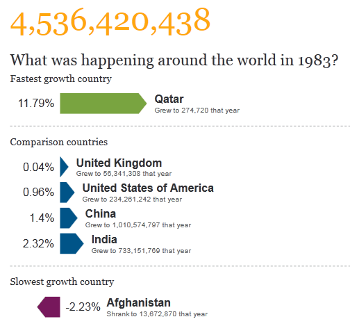
As the world population fast approaches 7 billion, The Guardian has published this excellent resource where you can enter your date of birth to find out what the world's population was on that date, as well as information on how different countries were growing at that time.
Check it out here! This is what the world population was on my date of birth...

Check it out here! This is what the world population was on my date of birth...
Wednesday, 22 July 2009
Breathing Earth
www.breathingearth.net
I had forgotten about this great site until I saw it mentioned on Funky Geography. It is a simulated world map showing the CO2 emissions and birth and death rates by country happening in real time.
I had forgotten about this great site until I saw it mentioned on Funky Geography. It is a simulated world map showing the CO2 emissions and birth and death rates by country happening in real time.
Saturday, 15 November 2008
World population
Year 10 have just started Population. We have started to look at the distribution of the world's population and played population top trumps. We also recorded the world population (using this world population clock) at the start of the lesson and at the end to see the rate at which it is increasing. Here's a couple of useful things related to population. Firstly, a BBC learning zone clip on 'Is the world's population spiralling out of control?'.
(Thanks to Odblog for highlighting this)
Secondly, this is the map that was used to describe the distribution of the most densely and sparsely populated places in the world. The map came from worldmapper where there's a whole host of similar world maps which have been resized to show different characteristics.

Finally, a fantastic tool using statistics to graphially show different characteritics of countries and their population. Here's one showing the relationship between life expectancy and income per person. The size of the circles shows the total population. Click on the graph to play around with the example one, or go to the gapminder site to create your own graph.

(Thanks to Odblog for highlighting this)
Secondly, this is the map that was used to describe the distribution of the most densely and sparsely populated places in the world. The map came from worldmapper where there's a whole host of similar world maps which have been resized to show different characteristics.

Finally, a fantastic tool using statistics to graphially show different characteritics of countries and their population. Here's one showing the relationship between life expectancy and income per person. The size of the circles shows the total population. Click on the graph to play around with the example one, or go to the gapminder site to create your own graph.
Subscribe to:
Posts (Atom)